Designing a navigation bar
Nearly every website has one, and getting it right is tricky. Here's what I did.
Lately, I’ve been starting to work on V2 of my website, the one you are reading this on.
For V2, I have planned a new design, as the current one from V1 was only transitional from the get-go and was bonked together to get off the ground quickly.
Now, for this redesign, I started drafting ideas, and it’s always helpful to start by considering the different destinations and features your app/ website provides first.
It’s crucial to expose a good navigation hierarchy at the top of the navigation stack. But designing a good navigation and information flow is a whole other topic.
This time, I just want to focus on redesigning the nav bar.
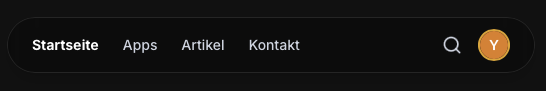
This is what I started with on my current/previous version of my website.

It fits the overall website design (that I also want to change) and does the job. But it looks old and dated, we waste space, and the most important problem arises when we look at it on mobile.
Due to the shrunken space available on mobile, we were forced to hide the navigation options behind an extra hamburger menu.
This means an extra tap for the user to reveal the following navigation bar.
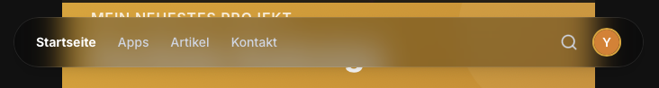
Now it spans nearly the entire top third of the space on the mobile device. This is by far not optimal.
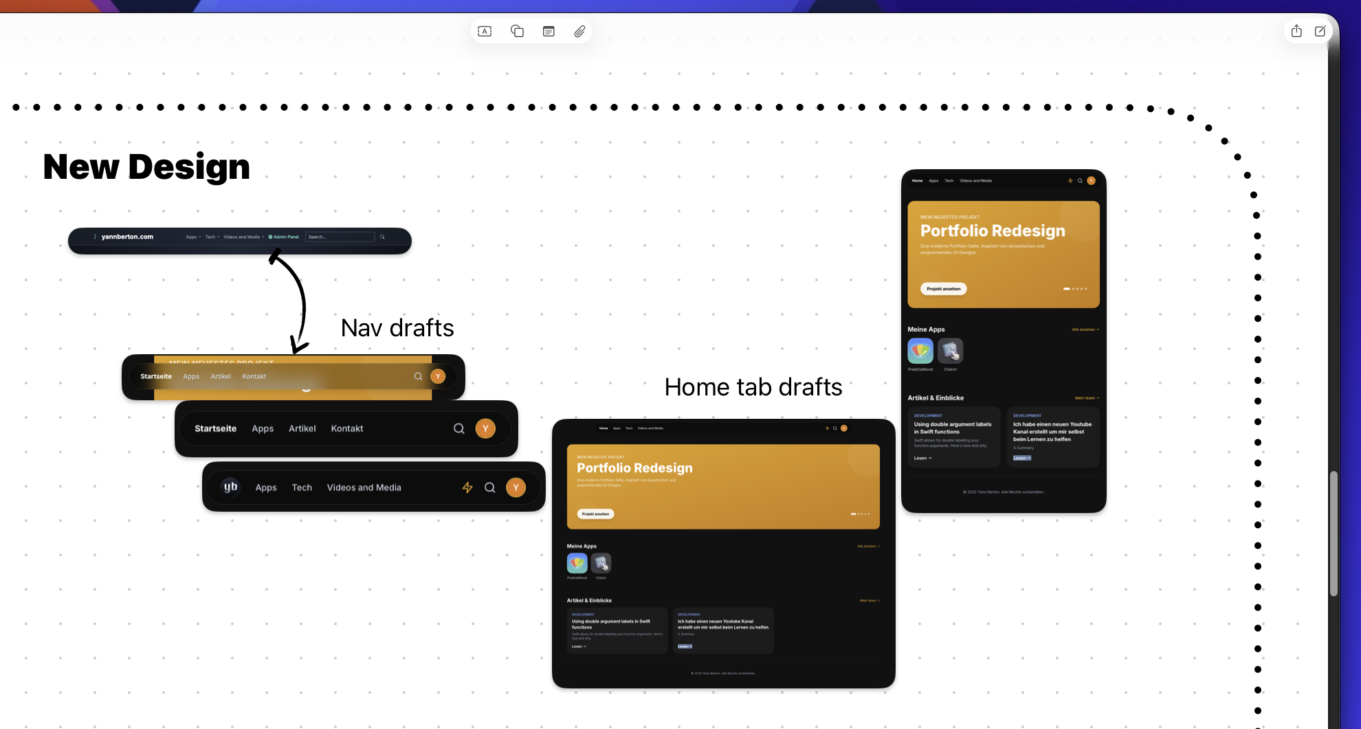
To remediate some of the issues, I quickly drafted another design and approach.
This is already on mobile, and as you can see, we don’t waste as much space. It is not optimal yet, and we need to test touch targets and areas on different mobile devices, as well as legibility with other people to see if the text is big enough.
As you can see, I’ve added a profile button as I plan to add account support to my website in the future.
Later, after I’ve finished designing, I will just add a feature toggle disabling the component until the system is ready.
And now for the fun part. A navigation bar should always stay on top, but you also don’t want to block content so that the user knows where he is.
Apple has led the way with this thought and implemented their tab bars in Liquid Glass.
We are going to shoot for a more frosted glass approach, but the idea is the same.
See as the content is still visible below and the colour bleeds into the edges of the navigation bar.
Now I wanted to replace the home button with my website icon.
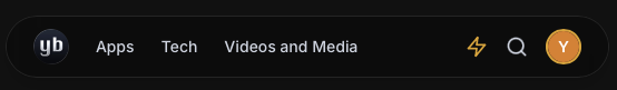
But I realised it doesn’t look clean, and now the tab-bar on the top won’t always answer the user’s question of “where am I?”
So I replaced the icon again and clearly named the tab “Home”.
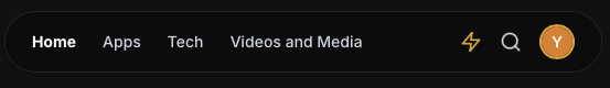
This is what I feel will be the final iteration of my navigation header / nav bar / tab bar for this release of the website.
It is a clear upgrade from what we came from and also strides into the direction I have in mind for my new design in general.
Usually, I like to organise my ideas and drafts / progress within my projects board. I use Freeform for this task.
Designing a good experience and user interface is an art form and is just so much fun.
I know this isn’t the best design out there and I certainly know those won’t be the last changes I will make to it, as you always have to react to user feedback.
But you can see a clear progression.
I hope this short share of my journey was helpful to some of you out there.
Thank you for reading and always navigate with joy!
Update History
Published the article.
Article has been drafted and completed. Some commas were fixed. Published.
Created new article titled 'Designing a navigation bar'
About the author

Yann Gwenaël Berton
I’m passionate about creating software solutions that matter and have a real impact on people’s lives. Personally, I believe it’s an art to craft a user experience that leaves users astounded, and I’m constantly striving to improve my skills in this area.
Read more